

ROLE
UX Designer
TIMELINE
10 weeks
TEAM
Cal Poly Iter8
Instilling Trust In My City’s Transit System
Redesigning San Luis Obsipo’s mobile transit application to build user confidence and platform reliability
SKILLS
Visual Design User Research Interaction Design Usability Testing
TOOLS
Figma
✦ PROJECT OVERVIEW
SLO Transit System is the public transportation system for the city of San Luis Obispo. In addition to daily fixed routes, SLO Transit provides services to the local university, Cal Poly SLO.
Riders rely on SLO Transit’s many bus routes to work, study, and attend events. However, the current solution to navigate their services — the SLO Transit mobile application — is unguided, inconsistent, and difficult to navigate, which can discourage people from riding the bus and hinder the county’s efforts to reduce emissions.
As a UX designer, I worked closely with my fellow designers and project managers to conduct user research, enhance the mobile app experience, and validate our solutions with real users.
01
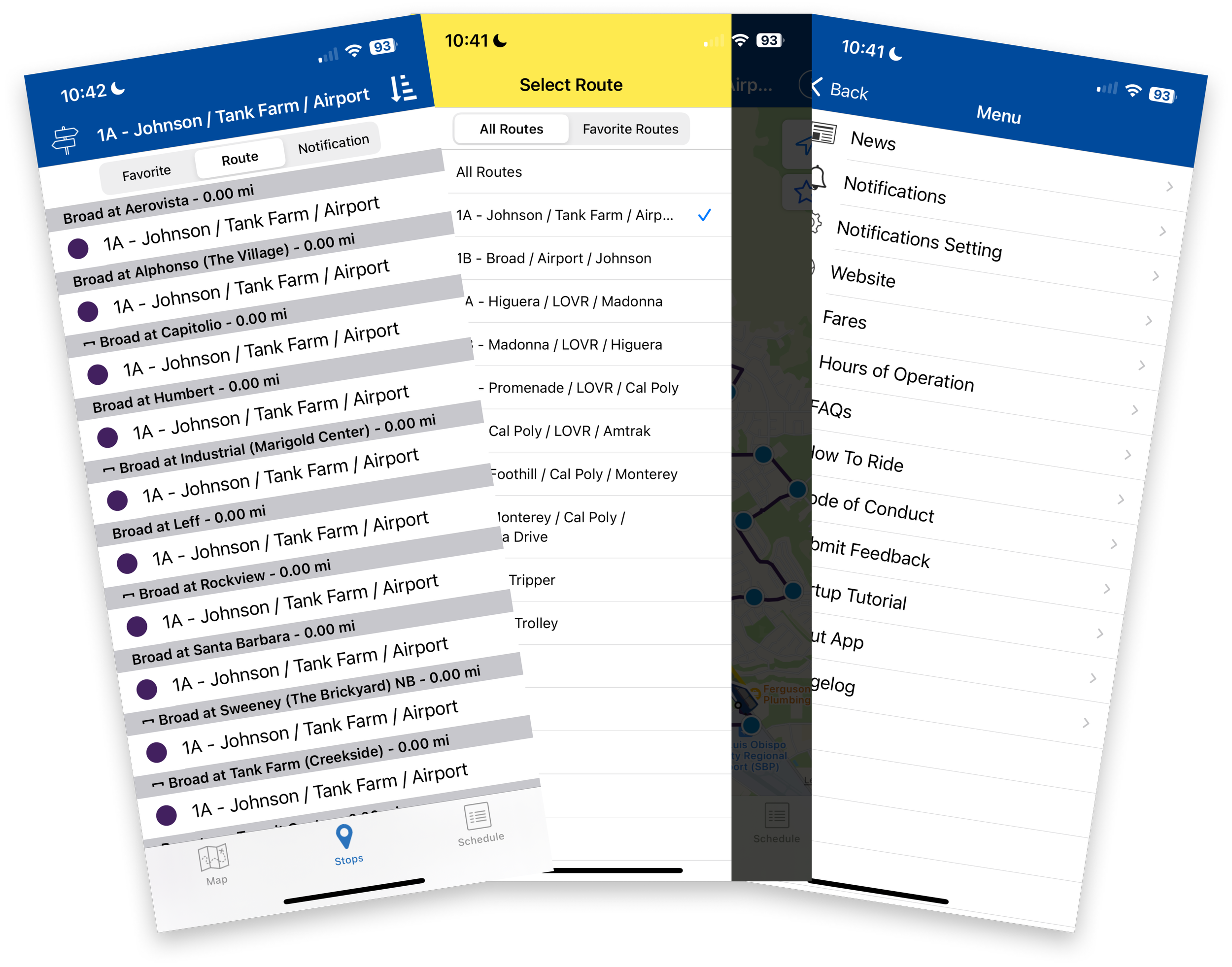
Becoming A Rider
Riding with SLO Transit

Selection list of all routes
The Customer Journey
Non-interactive map
MOTIVATION
Background
The SLO Transit app provides details on bus stops, routes, and bus schedules. It allows riders to favorite stops and displays a non-interactive map.
Since many students and locals rely on SLO Transit as their main source of transportation, they expect this information to be clear and accurate.
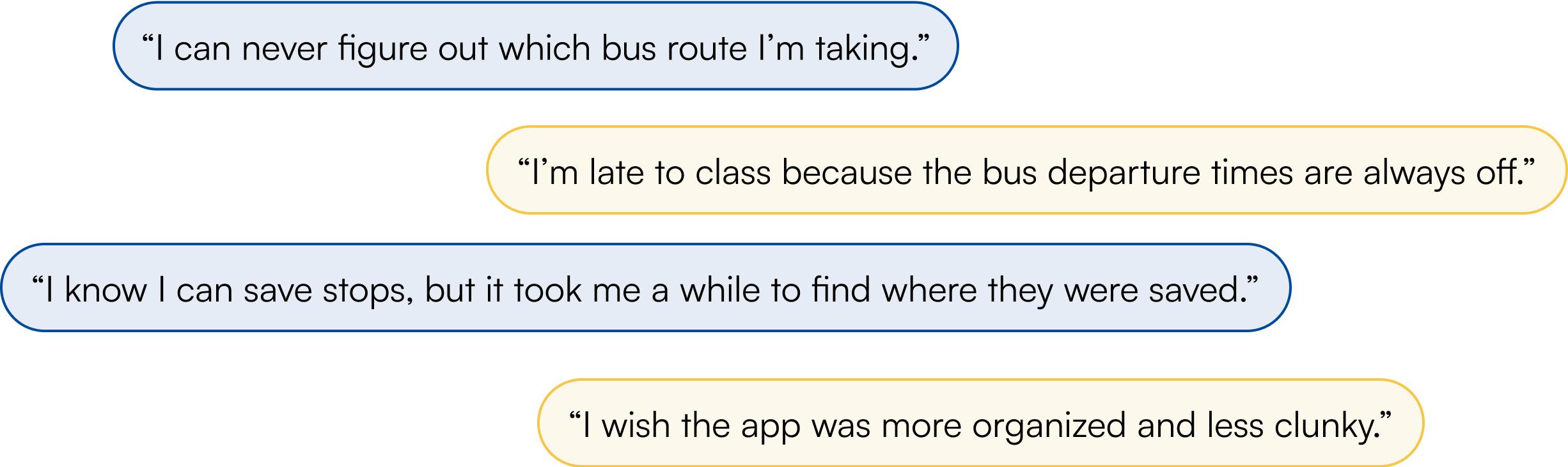
But many riders have voiced their concerns about the current app:
To empathize with the audience, I began by creating a customer journey map. This chart mapped out the entire interaction a rider would go through when using SLO Transit. This allowed me to see the typical step-by-step process users go through. To create this map, I first downloaded the app on my personal device and rode the bus a few times.

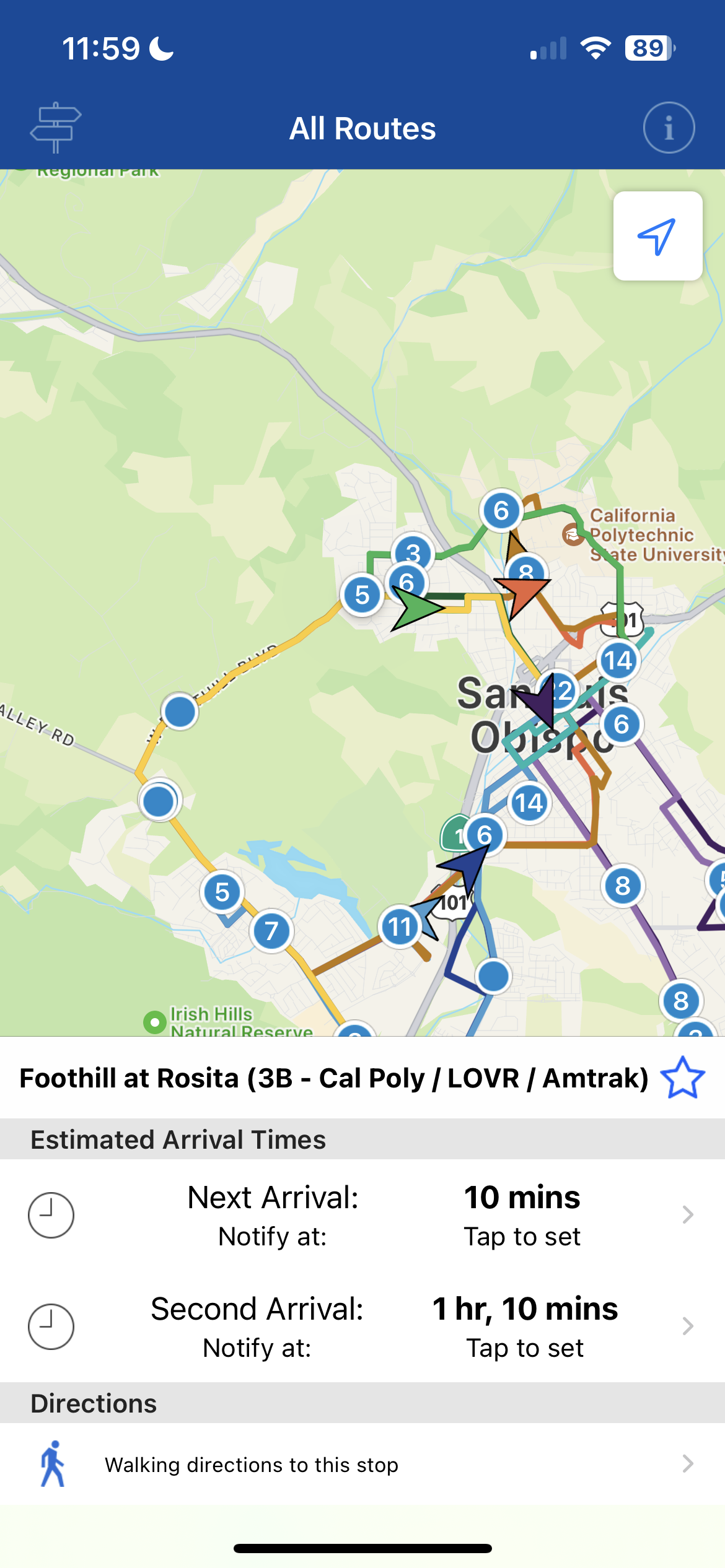
Bus stop details

With these motivating factors in mind, I asked myself…
HMW develop a more sustainable solution that decreases rider confusion and increases ridership?
02
Diving Deep
1. Competitive Audit
I worked together with my team to gather and analyze various transportation applications to understand the industry standards and what users were familiar with.
Conducting the Competitive Audit
TripGo
myStop Mobile
2. User Interviews
My team and I also conducted 9 user interviews with Cal Poly students and staff, San Luis Obispo residents, public workers, as well as a representative from SLO Transit.
What successful things were other transportation apps doing? What did users like?
Each of us were assigned to look at 3 different transportation apps around the world. After analyzing them on our own, we came together and reviewed what we (as users) felt about these apps’ usability and UI. I also went further and read reviews on the app store that customers had left to investigate what people were saying and how they were feeling. Here are the three I analyzed:
Rome2Rio: Trip Planner


Riders Voice Concerns Over SLO Transit App
UNDERSTAND
🟢 Progress bar to signify estimated time, picture of the bus stop for easy recognition, visual consistency
🔴 Map not very descriptive, ambiguous use of icons
🟢 Time overview on map, CO2 emission tracker, disability accessibility features
🔴 Crowded UI, difficulty distinguishing between routes/modes of transportation
🟢 Good visual hierarchy, simple design and clear step-by-step process, in-app service alerts
🔴 Service alerts not distinct, no way for user to navigate back to home screen, unclear route information
Other competitors we looked at that are not depicted include: Apple Maps, Google Maps, NYC Transit, blablacar (UK), Cabify, Transit, Moovit, Whiz, TransLoc Rider, CityMapper, AC Transit, Transit Go, One Bus Away, BART, Japan Travel, and VTA EZfare.
Interviewing riders revealed common pain points that users were facing. For example, users commonly had trouble understanding when buses arrive and finding which bus lines to use to get to their final destinations. First-time and infrequent interviewees voiced concerns about the app’s lack of guidance in helping them choose the right bus to take. With these points, I suggested to my team that we focus our ideation efforts on the earlier steps on the journey map: planning and deciding on bus routes.

I took user interviews insights and converted them into How Might We notes to consolidate opportunities for improvement. I came up with almost 30 HMW statements; take a look below at a few of them1 These statements provided my team with a bank of prompts for the next stage: Ideation.

03
Sketching & Brainstorming
Translating Words Into Designs
IDEATION
Each of us drew from the must-have features and design elements from our How Might We statements to sketch ideas. We brainstormed in words, then drew sketches, and then iterated on each other’s sketches. With this big brain dump, we each created 3-panel storyboards showcasing our best solutions.

After drawing solution sketches, we critiqued each other's drafts and voted on the storyboards we believed showed the most simple and practical navigation. We then decided on the key features we wanted to include in our redesign. Some of the main features we came up with include:
An onboarding feature that aids first-time riders in understanding the app's key features
A trip overview page that gives riders a brief overview of their ride with clear iconography
Photos of all bus stops to make it easier for riders to locate specific stops
Then, I built out user flows connecting all the sketches and key features. The user flow showed the order in which the user would navigate the revamped mobile app. I mocked up wireframes to complete these flows, turning them into one cohesive storyline.

Main user flow, includes trip planning and viewing individual bus stops
Wireframes for viewing lines
and general information
Onboarding user flow (pretty simple!)
04
Mid-Fidelity Prototype
Testing Out The Flow
PROTOTYPING
After mapping out the user flow, I modeled out mid-fidelity wireframes of the redesign using Figma. During this experimental phase, I incorporated many of our ideas into a tangible product in order to capture how well the flow we came up with worked. In the mid-fidelity wireframes, I included main features such as:
Incorporating trip planning to assist users in choosing which line to take and which stops to board and depart at
Including a trip overview and step-by-step directions to walk to a given bus stop, board the bus, and eventually arrive at your destination
Adding a favorites section on the Home page for users to save frequently used routes and lines

05
Testing Initial Designs
Potential Users Revealed Key Insights
USABILITY TESTING
We conducted a total of 10 usability testing interviews with participants ranging from those who were inexperienced transit users to frequent SLO Transit riders. After freely exploring the prototype, participants were given scenario-based questions and asked to take us through how they would navigate the app to accomplish specific tasks. From the interviews, we found that:
🔴 Iconography and bus routes were difficult to identify

Users found bus lines and bus stops were disorganized and hard to distinguish. For example, circle icons were used for both the bus line 2A and the Cal Poly Kennedy Library stop.
🔴 Feature enhancements were missed by testers

Users were not aware that our prototype allowed them the ability to schedule trips ahead of time and had safety features available (i.e., share ride status option).
In addition, we found that essential bus information was not addressed. For example, frequent riders commented that the differences in A and B lines were not clear, the change in run times during different seasons was not articulated, and transit center break times were not emphasized.
06
High-Fidelity + Design System
Improving the Experience
ITERATIONS
After analyzing user testing insights, I used these to create our high-fidelity screens. Users revealed that the old interface felt outdated and clunky, so working with my project manager, we created new components and changed the typography to give the redesign a more modernized and fresh look. I gathered inspiration from more familiar transit apps such as Google Maps and Uber.
Scheduling a Route
Instead of using a dropdown for scheduling trips ahead of time, I suggested two prominent CTAs: “Leave now” and “Schedule for later”. Not only do these buttons draw the users attention to this feature, but they also closer in contact point with the keyboard.
Before

Bus Line vs. Bus Stop
Bus lines and bus stops used the same circular iconography, making it difficult to distinguish between them. By changing bus stop icons to rounded squares, it not only makes the distinction more clear, but it also stays consistent with other ‘Favorites’ icons.
Before

Highlights from our design system ⤵︎

After

After


07
Spoiler Alert!
THE REDESIGN
Can’t wait to see it in action? Check out the prototype down below 😏
The SLO Transit App: Redesigned.
Thanks for scrolling down here! Let me walk you through a breakdown of the redesigned SLO Transit app’s key features:
Onboarding
Simple tutorial for first-time riders

For first-time riders, the onboarding flow will provide them with basic information on what the SLO Transit app provides. Users have the option to skip the onboarding process throughout each stage of the flow. We also added a fun little bus animation!
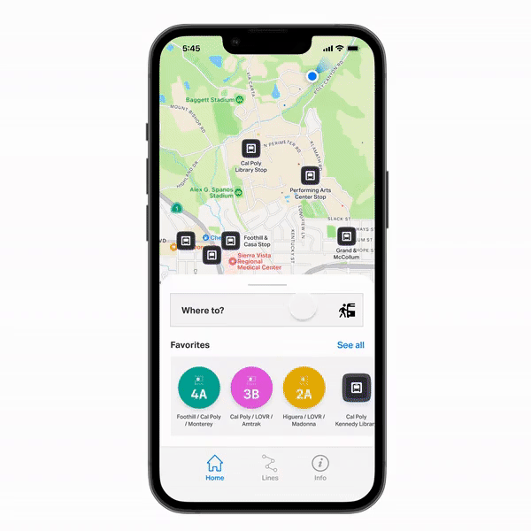
Add favorite stops and lines
Easily access frequently used routes

For frequent riders, being able to have easy access to commonly used lines is important. Therefore, bus lines as well as individual stops may be added to the user’s Favorites. Their Favorites are displayed on the Home page for easy access.
Enhanced ‘Lines’ page
Keep track of possible route delays and upcoming arrivals

The improved layout clearly outlines various bus lines with distinct colors as well as bus status icons. Users can be notified about upcoming stops and important changes in arrival times. Next and 2nd next arrival times are featured for easy access.
Plan a trip
. . .
. . .
. . .
Get to a specific destination worry-free
Users may set their destination and plan trips ahead of time. The app will suggest possible routes as well as the fare, calories burned during walking, and the amount of CO2 emitted by using the bus. Users can save the trip overview to Favorites or begin their trip now!
Live directions
. . .
Provides step-by-step directions to local destinations

When the preferred bus route is chosen, our app will provide specific guidance on directions (including walking directions and when to get off which bus stops). Live information on bus arrival times and departures will also be available.
Safety tools
. . .
Access essential features to ensure rider safety

Our application's safety tools allow users to add contacts to track their ride as well as share the user's estimated time of arrival with family or friends. They are easily accessible from the live map and allows users to comfortably ride the local bus.
08
Brain Dumping
If I had more time…
REFLECTIONS
This project was completed within a 10-week timeline, so there are still a lot of ideas I have that can make the redesign even better! I would like to add more accessibility functions, such as multiple languages and ensuring that the iconography is crystal clear and understandable. Our team also thought it could be fun to collaborate with local San Luis Obispo stores, such as coffee shops, to display live bus time arrivals and departures so that users are able to wait for transportation comfortably.
As one of my first UX projects tackling the design process from end to end, I had so much fun and gained a lot of technical and interpersonal skills. I became more well-versed in Figma and experienced working on a UX project within a team. I loved how much I was able to collaborate with other students and appreciated all the support my team gave me.
One feature roadblock we faced was debating whether to use a standard timetable or live updates / bus tracking and which would be better for the user. I learned to constantly check back in with users and really dig deep into their core needs in order to determine the most essential features.
Thank you to the Modernization Team and Cal Poly Iter8 for this memorable experience! 💚